

How to Choose Paper for Pointed Pen Calligraphy
Quick Summary
For pointed pen calligraphy, choose paper that is smooth, well sized and medium weight, roughly 120 to 160 gsm for everyday practice. Smoothness lets the nib glide, good sizing stops ink feathering, and a sturdier sheet resists cockling and show-through.
- Pick a tight, even surface with few visible fibres so the nib slides without snagging.
- Choose well-sized paper; lightly sized sheets let ink wick and feather along fibres.
- Around 120 to 160 gsm suits most everyday practice and finished pieces.
- Heavier sheets above 200 gsm suit finished, display or framed work.
- Test candidate papers side by side with your own nib and ink before committing.
Table of Contents
- What Makes Paper Work for Pointed Pen Calligraphy
- Paper Weight for Calligraphy: What the Numbers Mean
- Smooth Paper for Dip Pen Calligraphy and Why It Matters
- Stopping Ink Bleed, Feathering and Nib Snagging
- Testing Paper Yourself: A Side-by-Side Method with Your Own Nib and Ink
- Practice Paper or Finished Work: Choosing the Right Sheet for Each Job
- Booking Your Next Papers: Sampling Our Handmade Range
- Frequently Asked Questions
What Makes Paper Work for Pointed Pen Calligraphy
Paper decides whether a pointed pen calligraphy nib glides or snags, whether your hairlines hold, and whether ink spreads into a soft blur. For most calligraphers, the right sheet comes down to three things: how smooth the surface is, how much it absorbs, and how much it weighs. Get those right and the nib does the rest.
Pointed pen work is unforgiving. The nib is fine and firm, so any roughness or fibre sticking up from the surface catches the tines. Ink that soaks in too fast spreads along those fibres, softening the edges of every letter.
Smoothness and surface texture
A smooth surface lets the nib slide. Look for paper with a tight, even finish and few visible fibres. Rough or heavily textured sheets, the kind designed for watercolour, can drag the nib and make your downstrokes wobble.
Surface sizing also matters. Sizing is the coating that controls how ink sits on the paper. Lightly sized papers absorb ink quickly, which often causes feathering. Well-sized papers hold the ink on top long enough for a clean line.
Paper weight and thickness
Heavier paper tends to resist buckling when wet and gives a more stable writing base. Very thin sheets can ripple or show ink through to the other side. Medium-weight papers are usually the most practical choice for everyday pointed pen practice.
Paper Weight for Calligraphy: What the Numbers Mean
Paper weight is usually given in grams per square metre (gsm) (bsigroup.com). The higher the number, the thicker and sturdier the sheet, but the number alone will not tell you whether a paper suits a pointed pen. Two sheets at the same gsm can behave very differently depending on how densely the pulp is pressed and how the surface is sized.
For pointed pen work, weight matters for three reasons. First, a flexible nib presses down on the sheet on every downstroke, so a light sheet can flex, cockle or dent under repeated pressure. Second, ink is water-based, and a thin sheet will cockle as it dries, which distorts the line you have just written. Third, a heavier sheet resists show-through, so you can write on both sides and photograph finished work without the reverse showing.
As a working guide, most pointed pen calligraphers find these bands useful:
- Around 80-100 gsm: fine for drills and rough practice where you expect to fill the sheet quickly, but prone to cockling and show-through with wetter inks.
- Around 120-160 gsm: the practical middle ground for everyday practice and most finished pieces. It holds a stable writing surface, resists light cockling and takes most fountain-pen and dip-pen inks without strike-through.
- Around 200 gsm and above: useful for finished work, display pieces and anything you plan to scan or frame. The extra body keeps the sheet flat and gives a more substantial feel, but it is usually more than you need for drills.
Thickness and weight are related but not identical. A hot-pressed sheet at 160 gsm can feel denser and smoother than a loosely formed sheet at 200 gsm, because pressing closes the surface fibres. Handle samples where you can, and pay attention to how the sheet responds when you run a damp finger lightly over it: a sheet that pills or lifts fibres will do the same under a nib.
Watch out: do not assume that a higher gsm means a better writing surface. A heavy, rough watercolour sheet can still snag a fine nib, and a lighter, well-sized sheet can outperform it for pointed pen work.
Our paper weight guide for creative projects explains how GSM and thickness affect different kinds of work, which is useful if you are choosing between a practice pad and finished pieces.
The table below summarises the weight bands the article suggests for pointed pen work.
| Weight band | Best for | Key difference |
|---|---|---|
| Around 80-100 gsm | Drills and rough practice | Prone to cockling and show-through |
| Around 120-160 gsm | Everyday practice and most finished pieces | Stable surface, resists light cockling |
| Around 200 gsm and above | Finished work, display and framing | Keeps sheet flat, more substantial feel |
Smooth Paper for Dip Pen Calligraphy and Why It Matters
Smooth paper is the foundation of clean dip pen work. A smoother surface reduces nib drag, keeps hairlines crisp, and makes it easier to control pressure on thick strokes.
Many calligraphers find that smooth paper for dip pen calligraphy is the single change that improves their letters most. It does not need to be expensive, but it should feel consistent from sheet to sheet.
Stopping Ink Bleed, Feathering and Nib Snagging
Most paper problems with a pointed pen show up as one of four symptoms. The useful skill is not memorising a list of good papers but reading the symptom and working back to the cause, because the same symptom can come from the paper, the ink or the nib.
Feathering (fuzzy, hairy edges). Ink is wicking sideways along surface fibres before it dries. The usual cause is a lightly sized or absorbent sheet, or an ink that is too thin for the paper. Try a more tightly sized sheet first; if the feathering persists, the ink is the variable. A common pattern is that iron-gall and pigmented inks feather less than thin dye-based inks on the same sheet.
Bleed or strike-through (ink visible on the reverse). Ink has passed through the sheet rather than sitting on the surface. This is usually a combination of a thin sheet and a wet nib load. A heavier, well-sized sheet fixes most cases; writing with a lighter nib load and letting the reservoir run lower also helps.
Skipping or railroading (the nib opens and leaves two parallel lines with a gap). The nib is not delivering ink fast enough for the speed of the stroke, often because the paper is too smooth and non-absorbent for the ink, or because the nib is slightly misaligned. Try a sheet with a little more tooth before adjusting the nib.
Snagging or catching (the tines dig in or the nib stutters). Surface fibres are standing up and catching the fine point. Rough, heavily textured or soft-sized sheets cause this. A smoother, harder-sized finish usually resolves it, and a lighter hand on upstrokes reduces the effect on borderline sheets.
A quick diagnostic order saves wasted paper. Write the same short word on the suspect sheet with your usual nib and ink. If the edges are fuzzy, suspect sizing. If the reverse shows through, suspect weight. If the line breaks up, suspect the nib or ink flow. If the nib catches, suspect surface texture. Change one variable at a time, because changing paper and ink together tells you nothing about which one was at fault.
Watch out: do not judge a paper by how it looks in a shop. Ink behaviour only shows once you write on it, and some sheets that feel smooth in the hand still feather with a wet nib.
Testing Paper Yourself: A Side-by-Side Method with Your Own Nib and Ink
Marketing claims about paper are rarely enough. The most reliable way to choose is to test samples with your own nib and ink.
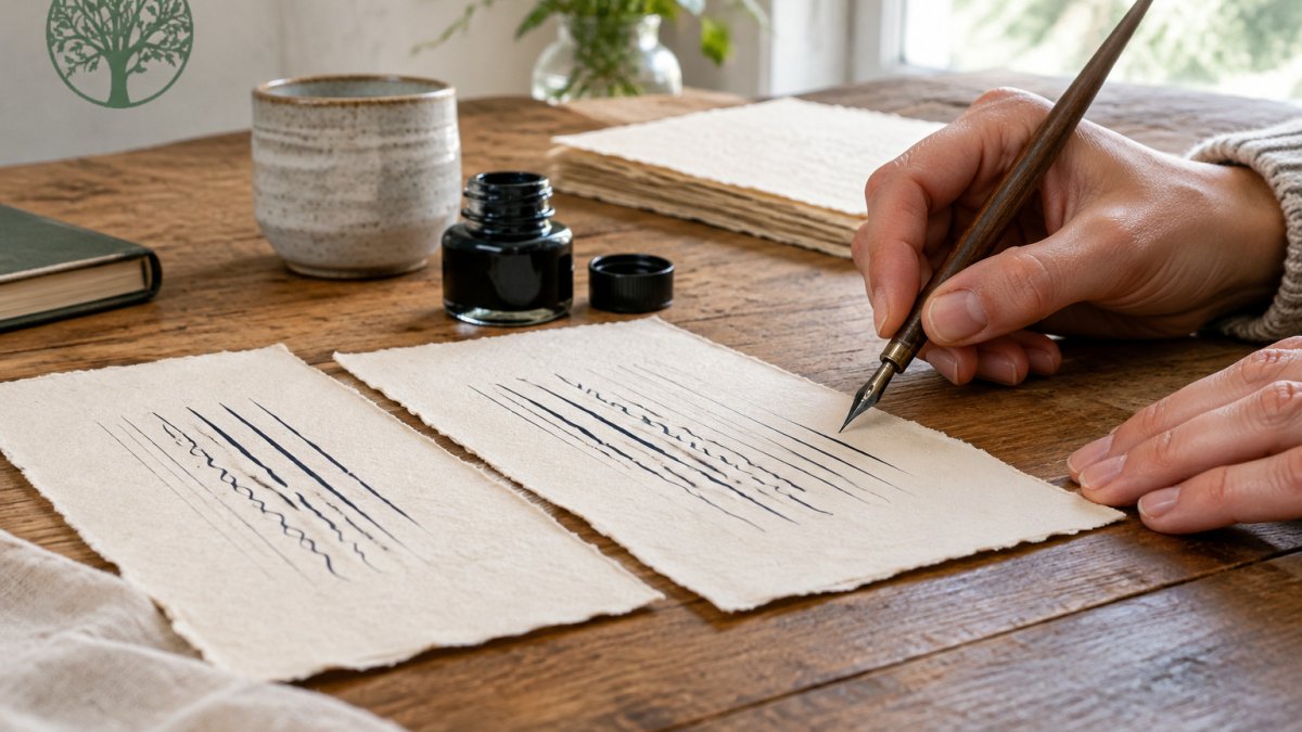
- Cut the same test strip from each candidate sheet.
- Write the same line of letters on every sheet, using the same nib, ink and pressure. For a smooth white option to compare against your current paper, see Watercolour Paper - White.
- Let each sample dry fully, then check the hairlines, edges and any ink spread.
- Lay the samples side by side and compare how sharply each one holds the line.
Hold the finished samples up to the light to check for show-through. Repeat the test with a second nib if you use more than one.
For a smooth white option to compare against your current paper, our Watercolour Paper - White is a useful reference sheet.
Practice Paper or Finished Work: Choosing the Right Sheet for Each Job
Practice and finished work have different needs. Practice sheets can be more affordable and forgiving, since you expect to make mistakes. Finished pieces call for a sheet that looks and handles well from start to finish.
For drills and everyday practice, a calligraphy practice pad is a practical choice, and our Calligraphy Practice Pad is designed with that use in mind. Save your best sheets for finished work, where surface quality and weight matter most.
Booking Your Next Papers: Sampling Our Handmade Range
If you are ready to compare, sampling a few options is the quickest route to the right paper. Our handmade Watercolour Paper - White is made from 100% recycled cotton rag and is available in several sizes, with prices from £0.40 per sheet. The Watercolour Card - White is £0.60 per sheet.
Frequently Asked Questions
What is the best paper for pointed pen calligraphy?
For most pointed pen work, a smooth, fairly heavy paper with low ink absorbency gives the cleanest hairlines and the crispest thick strokes. Medium-rough handmade cotton rag papers, such as our 150gsm Watercolour Paper at £0.40 per sheet, suit practice and finished pieces where a little texture is welcome. Smoother surfaces suit very fine, detailed lettering. Always test with your own nib and ink first, since the same sheet can behave differently with different formulations.
What paper weight is best for calligraphy practice?
Practice work usually benefits from a paper around 120gsm to 150gsm. It is firm enough that the nib does not dig in, and light enough to keep costs down when you produce many practice sheets. Heavier card, such as our 300gsm Watercolour Card at £0.60, is better reserved for finished pieces. Thicker paper also tolerates repeated ink loading better than thin copy paper.
Can I use printer paper for pointed pen calligraphy?
You can practise on printer paper, but it is a poor choice for pointed pen work. Standard copy paper is thin, absorbent and often has a surface sizing that lets ink feather and bleed through. It also tends to catch the nib, which makes hairlines wobble. Moving to a smooth, heavier handmade sheet gives you more control and shows you what your strokes actually look like.
How do I stop calligraphy ink from bleeding or feathering?
Bleeding and feathering usually come from paper that absorbs ink quickly. Choose a paper with low absorbency and a firm surface, keep your ink loading light, and let each stroke dry before layering. Test your ink on the paper you plan to use, because some formulations spread more than others. If a sheet feathers with your ink, try a smoother or more tightly sized paper rather than adjusting your technique alone.
