

How to Match Coloured Envelopes With Stationery
Last Updated: November 16, 2026
Quick Summary
Match coloured envelopes with matching stationery by choosing an envelope shade that either echoes the card or contrasts with it on purpose, then confirming the size and testing a sample first. Keep one colour dominant and use the second as an accent, so the set looks deliberate rather than pieced together.
- Choose the card first, then pick an envelope that echoes or contrasts with it.
- Keep one colour dominant and use the second as the accent.
- Blush envelopes with cream cards are a dependable choice for weddings.
- Check internal envelope dimensions, since deckled handmade envelopes lose some space.
- Order one sample envelope and hold it against the card in daylight before committing.
Table of Contents
- How to Choose Envelope Colours That Match Your Stationery
- Matching Envelope Sizes to Your Cards and Invitations
- Wedding Invitation Envelope Colours That Work Together
- Paper Weight, Finish and Print Compatibility
- Recycled Envelopes for Invitations and Eco-Conscious Stationery
- Ordering Samples and Planning Your Matching Stationery Set
- Frequently Asked Questions
Coloured envelopes with matching stationery turn a simple card into a considered gift. The envelope is often chosen last, even though it is the first thing the recipient touches. A well-matched envelope tells the reader that the whole set was planned, not pieced together from whatever was in the drawer.
The envelope also sets expectations. A blush pink card in a cream envelope feels soft and gentle, while the same card in a deep navy envelope feels formal and bold. Get the pairing right and the set looks deliberate. Get it wrong and even good paper can look like an afterthought.
How to Choose Envelope Colours That Match Your Stationery
Start with the card, not the envelope. Browse the cotton rag card and envelope range to see matching colourways in person. Pick the colour that carries the message, then choose an envelope that either echoes it or contrasts with it on purpose. Matching gives calm and cohesion. Contrast gives emphasis and drama.
The most useful way to think about it is to place your card colour on a colour wheel and decide how far around the wheel you want the envelope to sit. Four relationships cover almost every set you will build.
Analogous (neighbouring shades). Colours next to each other on the wheel, such as blush and cream, or dusky green and sage. These read as soft and harmonious and suit weddings, thank-you notes and quiet occasions. The risk is that a very close pairing can look like a near-miss rather than a match, so keep a clear step between the two shades.
Complementary (opposite shades). Colours across the wheel from each other, such as navy and a warm blush, or green and a soft red. These give the strongest contrast and suit celebrations and bold brand stationery. Use one colour as the dominant field and the other as the accent, otherwise the set competes with itself.
Neutral anchor. A cream, ivory, kraft or grey envelope lets a coloured card do all the talking, and a coloured envelope against a white or cream card does the reverse. Neutrals are the safest choice when you are producing a large run or are unsure how a shade will print.
Monochrome with a tonal step. One hue in two values, such as a pale blush card in a deeper rose envelope. This looks deliberate and expensive when the step is clear, and muddy when it is not.
A simple rule: keep one colour dominant and use the second as the accent. If both colours compete equally, the set can feel busy.
If you are unsure, buy a single envelope in each shade you are considering and hold it against the card in natural light before you commit to a full order. Screens often show colours differently from paper.
Some pairings work reliably across most occasions:
- Blush envelope with a cream or ivory card: soft, romantic and easy to read.
- Dusky green envelope with a white card: natural and calm, suited to gifts and everyday notes.
- Denim blue envelope with a white card: clean and confident, with plenty of contrast for handwriting.
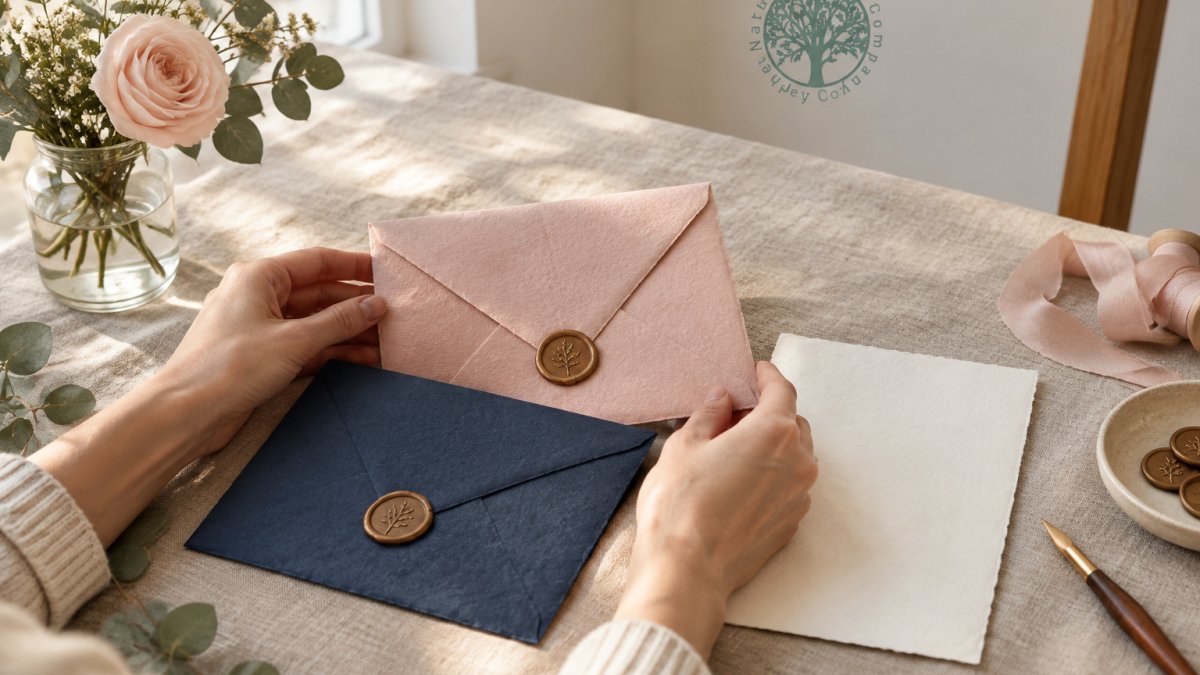
- Navy envelope with a blush or cream card: formal and striking, good for invitations.
Our guidance on colour contrast and readability for printed text explains why strong contrast matters, especially if the envelope will carry handwritten addresses.
Our Blush Handmade Paper Envelope (vegan) at £1.40 is available in blush pink.
Soft, Bold and Contrasting Palettes Explained
Soft palettes use muted shades close to each other on the colour wheel. They suit weddings, thank-you notes and quiet occasions. Bold palettes use saturated shades and often one strong accent. They suit celebrations and brand-led stationery. Contrasting palettes place two shades far apart, such as navy and blush, and rely on that gap for impact.
A simple rule: keep one colour dominant and use the second as the accent. If both colours compete equally, the set can feel busy.
Our Navy Handmade Paper Envelope (vegan) at £1.85 is available in navy.
Watch out: a pairing that looks balanced on screen can tip into busy once the deckled edge and texture are in your hand, so judge the final combination from physical samples rather than a monitor.
The four pairing relationships, and what each one suits, are summarised below.
| Pairing | Effect | Best for |
|---|---|---|
| Analogous (neighbouring shades) | Soft and harmonious | Weddings, thank-you notes, quiet occasions |
| Complementary (opposite shades) | Strongest contrast | Celebrations, bold brand stationery |
| Neutral anchor (cream, ivory, kraft, grey) | Lets the card do the talking | Large runs, unsure how a shade will print |
| Monochrome with a tonal step | Deliberate and expensive when the step is clear | One hue in two values |
Envelope prices by colour (£)
Matching Envelope Sizes to Your Cards and Invitations
Size matters as much as colour. An envelope that is too tight will crumple a card, and one that is too loose will look careless. Measure your card before you order envelopes, and check the internal dimensions rather than assuming a standard size.
The reliable method is to work from the card's finished size and add an allowance on every edge. Work from the card's finished size and allow some clearance on every edge, plus extra for thickness if the card is heavy or has inserts.
Worked examples for common formats:
- 5" x 7" card (127mm x 178mm): our 5 x 7 envelopes are sized to fit our 5" x 7" handmade paper and card, with the deckled edge accounted for.
Our 5 x 7 envelopes are sized to fit our 5" x 7" handmade paper and card. The Denim Blue Handmade Paper Envelope (vegan) at £1.85 is an example, measuring approximately 19cm x 14cm with its deckled edge. A C6 envelope, at approximately 16.6cm x 12cm, suits A6 cards.
Handmade paper is thicker and more textured than smooth stock, so the same nominal size can fit more tightly. If your card has a deckled edge or a mounted layer, size up rather than down.
Always order one envelope before buying a full set. Slide your card in, close the flap and check that it sits without strain. Then check the reverse: a card that slides around freely can shift in transit and crease at the corners.
Watch out: envelope sizes are often quoted as external dimensions, and a deckled or handmade envelope loses a few millimetres internally, so confirm the usable internal space before committing to a large run.
Wedding Invitation Envelope Colours That Work Together
Wedding invitations benefit from restraint. Two colours are usually enough: one for the card and one for the envelope, with a neutral or metallic accent if needed. Blush envelopes with cream cards remain a dependable choice, while dusky green suits outdoor or garden weddings. You can also pick up a ready-made coordinated card and envelope set that is ready to buy.
Handmade paper has a textured surface, so ink and foil can look different from smooth stock. Test your printing on a spare sheet first. Our Dusky Green Handmade Paper Envelope (vegan) at £1.85 is available in dusky green.
Paper Weight, Finish and Print Compatibility
Weight affects how an envelope holds its shape and how well it takes ink. Our envelopes are 150 gsm. The surface is medium-rough, so fine line printing may look softer than on smooth paper. Choose bolder typefaces for printed addresses and test any design before a full run. For a deeper explanation, read our guide to GSM and paper thickness.
Handmade envelopes are acid free, which means they will not yellow with age.
Recycled Envelopes for Invitations and Eco-Conscious Stationery
Many couples and gift-givers want materials that suit their values. Our envelopes are made from recycled cotton rag paper. No harsh chemicals are used in their production.
If sustainability is a priority, ask about sourcing and check the product listing before you buy, so you know exactly what you are getting.
Ordering Samples and Planning Your Matching Stationery Set
Order samples before committing. Screens shift colours, and paper always looks different in person. Buy one envelope in each shade you are considering, then place the card and envelope side by side in daylight.
Plan the full set in this order: choose the card, choose the envelope colour, confirm the size, test a print, then place the full order. Working through these steps in sequence avoids the most common mistake, which is discovering a colour mismatch after the set has already been printed.
Frequently Asked Questions
How do you match an envelope to a card?
Start with the card's dimensions, then choose an envelope that gives a few millimetres of clearance around it. Our 5 x 7 envelopes, for example, are sized to fit our 5 x 7 handmade paper and card. Check the dimensions in the product listing before ordering.
What colour envelope goes with a white invitation?
Blush pink, dusky green and navy are all available as handmade paper envelopes. Choose an envelope colour that suits your invitation design.
Which envelope colours work best for wedding invitations?
Soft shades such as blush and dusky green are available as handmade envelopes, as are denim blue and navy. Choose one main colour and one accent, and make sure the envelope colour appears somewhere in the invitation design. Test two or three options side by side in daylight before committing.
